Yellow Page Ad Design Tip #5

Get a FREE EVALUATION of your current Yellow Pages Ad
spacer
Yellow Page Ad Design
Ad Revamp

Call Today
1-800-339-2410
Professional Yellow Page Advertising Design
spacer
corner OUR COMPANY corner
Sample Ad Designs
Price Sheet

Money-Back Guarantee

FAQs
Company History

Contact Info

corner DESIGN TIPS corner

Yellow Page Ad Design
Use a Headline
Ad Space
Be Honest
Avoid 'Magazine Ads'
Use a Call-to-Action
Need Help?


corner NEW ARTICLES corner

Need Help with your Yellow Pages Headline?
Advertising Study: BMW Repair
Google Vs. The Yellow Pages
Customer Satisfaction Simplified
Ad Synergy and Your Business

Hours


FREE Yellow Page Ad Evaluation
Get a FREE Yellow Page Ad Design Evaluation. Just fill out our Easy Web Site Questionnaire. You have nothing to lose, everything to gain.
spacer
Home | Yellow Page Ad Design Tips | Yellow Page Design Samples | FAQ | Price List
spacer

Seven Powerful Tips to Dominate your Yellow Page Advertising Competition.

Yellow Page Advertising > Design Tips >
1 | 2 | 3 | 4 | 5 | 6 | 7

Yellow Page Ad Design Tip #5

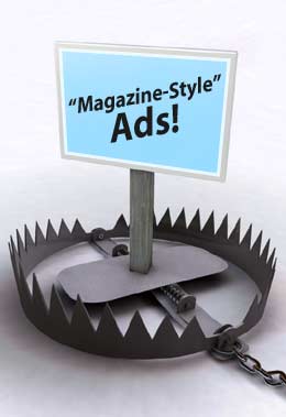
Stay away from clever, "magazine -style" ads.

We see this all the time. Business owners come to us because the brand new Yellow Page ad design they just paid $3000 for is doing just as badly as the ad the Yellow Page directory gave them. This is because "magazine style" advertising just doesn't work in the Yellow Pages.

Running a "magazine style" ad in your local Yellow Pages is like wearing a tuxedo to a baseball game. It just doesn't make a whole lot of sense.

The psychology of 'magazine style' advertising is completely different from the psychology of Yellow Page advertising. In a magazine or newspaper you're dealing with a leisure shopper—someone who may buy now or a year from now. Someone who might be enticed by a clever headline, and as a result, read the entire ad. In Yellow Page advertising this will never happen.

Let me make this clear. Yellow Page shoppers are ready to buy. They have already made the decision to purchase something. Now they want to get to it.

Very, very few people will take the time to read your entire ad when they are already geared up to make a purchase. Yellow Page shoppers are not in the leisure state-of-mind "magazine style" advertising works on. Yellow Page shoppers are in a buying state-of-mind. It's a completely different thing. They would just as soon sit down and read a dictionary as read through your entire Yellow Page ad.

This is how "magazine style" ads fail. "Magazine style" ads have a very specialized look. We have all seen them. We can spot them from a mile away and when we see them we know what to expect.

Very few magazine ads are informative. Most rely on an inquisitive headline that works with a picture. It's like a puzzle. I see this style of advertising on billboards all the time. Some are so baffling I can't even figure them out in the time it takes to drive past.

Could this be why Yellow Page shoppers tend to glance right over 'magazine style' ads? Do they instinctively reject them fearing some kind of confusing word puzzle might get in the way of what they really want to do—buy something.

Regardless of the reason behind it, the thing to remember is—"magazine style" ads deliver lack-luster performance in most Yellow Pages advertising situations. Never sacrifice your Yellow Page advertising sales for clever a "magazine style" ad.


6 Key Yellow Page Elements

"The Yellow Pages user is seeking information. Make their search as easy as possible. Provide them with as much information as they need to decide to call. And remember, everybody doesn't call for the same reasons. In an M/A/R/C study done for Ketchum agency, people rated detailed ads as the second most important feature in a Yellow Page directory.

"The information in your ad should be honest and, for the most part, it should be factual. Don't try to be funny. Humor varies too much from person to person.

"In a study done by Oglivy & Mather, over 70 percent of the respondents thought that advertisers insulted their intelligence. Don't make that mistake

"The single most amazing discovery I've made as a consultant to thousands of Yellow Pages advertisers of all sizes is this: When I ask my clients, 'Why should someone do business with you instead of your competition?' The first answer they give—the main benefit to the customer, the most important piece of information they have to convey about their business—is almost never found in their Yellow Pages ads. Make sure it's in yours."

— Barry Maher, pg. 185
Getting the Most From Your YELLOW PAGES Advertising.
1 | 2 | 3 | 4 | 5 | 6 | 7

Need help with your Yellow Page ad design?
Call the pros toll-free: 1-800-339-2410

Home | Yellow Page Ad Design Samples | Money-Back Guarantee | Yellow Page Ad Design Tips | FAQ's
Price List
| About Us | Links | Contact Us

spacer

Yellow Page Expert

1998 -2018 Copyright © Ad Revamp - The Yellow Page Ad Design Expert
www.AdRevamp.com (Premium Yellow Page Ad Design)

Employment Opportunities
- Site Map
Yellow Page Expert
corner spacer
corner