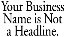
Seven
Powerful Tips to Dominate your Yellow
Page Advertising Competition.
Yellow Page Advertising > Design
Tips >
1 | 2 | 3 | 4 | 5 | 6 | 7 |
|
| Yellow Page Ad Design Tip #2 |
|
Use a compelling, straight-forward
headline.
You've
dazzled them with your amazing, emotionally
charged artwork. You've captured their
attention with the perfect
photo or illustration. You effectively
have a captive audience. Now
it's time to reel them in with your masterfully-crafted
headline.
You
have their attention. They are ready
to buy. Now they are looking
for a reason not to. It's
just human nature. We instinctively
look for value. Your
Yellow Page advertising already speaks
to them, they just want to be sure they're
going to get a good deal. They
want
to be certain
you're not
hiding
anything up your sleeve.
This is why
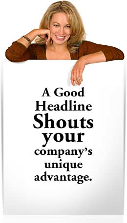
your headline should be honest, compelling
and straight-forward. This is not the
time for fancy word play.
Don't confuse them.
Don't give them a reason to jump to the
next
ad. This is the time to show off
your company's advantages, not your
sense of humor.
Give them what they want and they'll
pick up
the
phone
every time.
What continually works for our company
is a headline that is icing on
the cake. Yellow Page shoppers already
want to buy from you. They're all charged
up
to
make
a
purchase. Give them something extra—another
great reason to call you, instead of your
competitor.
Again—if you look through your Yellow
Page section, you'll find most businesses
missed the memo on headlines. A powerful
headline will give your Yellow Page ad
a clarity few competitors (if any) will
possess. Clarity is what Yellow Page shoppers
are looking for. Give it to them.
Video Storyboard Tests, a New York-based
research group, has conducted extensive
tests to determine the exact value of advertising
headlines. They did this by conducting
focus groups. In several studies they showed
these groups ads that included headlines,
then showed the same groups similar ads
without any obvious headline.
The results were clear. The headline
ads blew the others away.
Focus
group participants
consistently
scored headline ads dramatically
higher in areas like clarity, relevance,
memorability,
and persuasiveness. Those are pretty
strong attributes to consider while crafting
a
category dominating Yellow Page design. So, What kind of headlines work best?
Find a headline that solves a problem.
You've seen these a lot. Why? Because they
get great results. Good headlines will
often
suggest
a problem that if the reader continues
will be solved. This kind of interaction
is good for engaging the readers mind.
Communicating a key buying point is another
good way to craft a headline. If you have
a unique value advantage vastly superior
to your competitors, using it as your headline
will put them at a serious disadvantage.
Try to make your unique advantage as clear
as possible. Be sure to avoid overkill.
Five competitive advantages may feel
more like
a padded resume then a compelling reason
to buy from you. Another strong headline—though not as
powerful as the first two examples—is
the attention grabber.
If your company
does not have a unique advantage over
your Yellow Page competition, drawing potential
customers in with a powerful, attention
grabbing headline can tip the scales
in
your favor.
One-word headlines like,
"Yikes!", "Warning!", or "Wait!" can
all be very
effective for grabbing reader's attention.
Spend some time with it. A little thought
now will pay huge dividends once you've
found your irresistible headline—a headline
readers must, and will respond
to.
| 1 | 2 | 3 | 4 | 5 | 6 | 7 |
|
|
Need help with your Yellow
Page ad design?
Call the pros toll-free: 1-800-339-2410 |
|
|

